We're open daily this holiday! View holiday hours
Universe Update
Thoughts from a Planetarian: Visualizing Numbers
February 22, 2022
by Ryan Wyatt

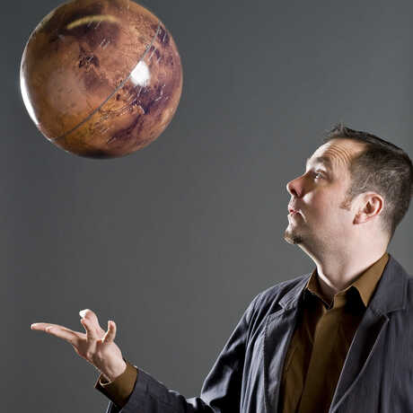
Image by Leo Reynolds/Flickr
0
One of the great challenges of communicating astronomical concepts is conveying a sense of scale. Indeed, with virtually any science communication, the very large and the very small—those aspects of the natural world that lie outside human experience—can be challenging to convey meaningfully. Astronomy just has a tendency to corner the market on extremely big things.
I’ve been reading a book recently, Making Numbers Count by Chip Heath and Karla Starr (Heath is most famous for his books Switch and Made to Stick), that addresses how to make numbers more relatable in general—so not just astronomy, not just science, but in a wide range of disciplines. As they put it, “Our brains were designed to grok 1, 2, 3, 4, and 5. After that, it’s just ‘lots.’” So true! And when you’re trying to wow audiences with “billions and billions,” that just becomes, “lots and lots and lots and lots and…”
As an added bonus, over and above some really great ideas about how to give numbers context, they also provide detailed calculations and references. So you can break out the old scratch paper and do the work yourself to see how the numbers get crunched.
A truly memorable example they present involves how to conceive of the relative fractions of saltwater and freshwater (and especially freshwater available for human use) on Earth’s surface. If you think of all Earth’s salt water as a one-gallon jug of water, then Earth’s freshwater, which is mostly ice, is equivalent to about three ice cubes in comparison. The amount of freshwater available to us in liquid form? Basically, the water dripping off a melting ice cube at any given moment.
That’s a pretty vivid, memorable image. Then, if you want to associate that with actual numbers, perhaps you can remember that 97.5% of Earth’s water is saline, roughly 2.5% is freshwater in the form of ice, and a mere 0.025% is fresh, liquid water. (Not to brag, but I actually wrote those numbers off the top of my head, then double checked them in the book. I’m pretty sure that having the mental image helped my recall considerably.)
Another example Heath and Starr cite is an aid to thinking about the distances that separate planetary systems. If you imagine our solar system as the size of a quarter (already a ginormous conceptual leap), then the nearest star, Proxima Centauri, which has at least a couple of planets around it, lies the distance of a soccer field away. So thinking about two quarters, separated by the length of a soccer field, gives you a sense of the separation of the distances between stars. (N.B. that the stars themselves are vastly smaller than those quarters. So if Neptune’s orbit were the diameter of that quarter, then I estimate that the Sun would be the size of a bacterium on George Washington’s earlobe. Stars are really, really, really really far apart.)
In the immersive space of the planetarium, using our “digital universe” software, we traffic in these enormous distances all the time. In our “Tour of the Universe” program, for example, we start at the International Space Station (ISS), speed through the Solar System (typically visiting a planet or two along the way), leave the Milky Way galaxy, and often travel all the way out to the Cosmic Microwave Background. That’s a vast range of scales, and in order to do that in a half-hour program, we have to “cheat“ a little bit.
How do we cheat? Nothing too egregious! We basically just vary our speed relative to whatever we’re viewing—typically, we speed up, traveling exponentially faster as we move away from a given object. When we’re near the ISS, for example, we move through virtual space at, say, a few meters per second, but when we leave the Solar System, we vastly exceed the speed of light! (In our virtual space, where we can break the rules. Spacecraft, of course, cannot do that, because the speed of light is a cosmic speed limit for physical objects.) This means that we can pretty easily address relative locations in space, and it offers insights into the relative size or distribution of objects in the Universe, but the sheer vastness and emptiness of space is difficult to convey.
(We deliver the “Tour of the Universe” every day at 4:30 p.m., and you can even watch a simulcast of the program every Wednesday on the Academy’s YouTube channel or on the Morrison Planetarium Facebook page. And if you’re feeling ambitious, the software we use for that program is free and open source! So you can download it and travel through the Universe on your own computer.)
At a much more human scale, the presenter team here at Morrison Planetarium recently shared a spiffy interactive from NASA’s Eyes on the Solar System. It allows you to take a close look at the James Webb Space Telescope (JWST), and in one mode, you can compare JWST in size to a variety of other spacecraft—along with a scientist and a stadium, but mostly spacecraft.
Seeing these bits of technology side by side provides quite a revelation, even for those of us who talk about them all the time. For example, the Hubble Space Telescope had to fit neatly inside the space shuttle cargo bay, so it was roughly schoolbus sized. And sometimes we refer to the JWST payload (with the telescope folded like super expensive origami inside) as being the size of a schoolbus. Nonetheless, seeing Hubble next to JWST elicited a bit of an, “oh, right,“ response, at least for me. And then, when I took a look at the Juno spacecraft, which is currently orbiting Jupiter, I was shocked to see that its “wingspan“ was nearly the same as JWST’s. Anyway, it’s a cool cheap thrill if you want to take a look at the latest and greatest space telescope side-by-side with other space hardware.
And indeed, that’s the fundamental message of Making Numbers Count. Numbers by themselves don’t mean anything, and even the most numerically literate people gain insight from analogies and visual reference that put numbers in context. My colleagues and I have certainly piloted professional astronomers through the digital universe in our planetarium and heard murmurs of recognition as they’ve seen a visual representation that confirms a concept may seem reasonable but not intuitive—the distribution of Trojan asteroids above and below the plane of the Solar System, for example, or the appearance of “stick figure” constellations in three dimensions. The same motivation that drove Heath and Starr to write their book inspires many of us to create visualizations that reveal patterns that numbers on their own can’t provide.
About the Planetarian
Ryan Wyatt assumed his role as Senior Director of Morrison Planetarium and Science Visualization at the California Academy of Sciences in April 2007. He has written and directed the Academy’s eight award-winning fulldome video planetarium programs: Fragile Planet (2008), Life: A Cosmic Story (2010), Earthquake (2012), Habitat Earth (2015), Incoming! (2016), Expedition Reef (2018), Big Astronomy (2020), and Living Worlds (2021). All eight shows are science documentaries that rely on visualization to tell their stories, but topics range from astronomy to geology, ecosystem science, and conservation. Trained as an astronomer, Wyatt has worked in the planetarium field since 1991; prior to arriving in San Francisco, he worked for six years as Science Visualizer at the American Museum of Natural History in New York City. Wyatt is cofounder and vice president of Immersive Media Entertainment, Research, Science, and Art (IMERSA), a professional organization dedicated to advancing the art and technology of immersive digital experiences. He served as co-chair of the 2019 Gordon Research Conference on Visualization in Science and Education (GRC/VSE), and served as the vice co-chair of the 2017 GRC/VSE.
0
Related science news
The visual culture of astronomy, from illuminated manuscripts and frescoes to engravings and satellite imagery.

Explore the fascinating field of study dedicated to making sure Martians don’t get chickenpox.