Science News
Mapping Your Carbon Footprint
Is your carbon footprint larger than your neighbors’ or friends’? There’s no way to know for sure, but if you live in the San Francisco Bay Area, you can now look at some general trends. Berkeley researchers have developed an interactive map that reveals emissions by neighborhood.
The researchers took a whole picture approach, calculating carbon footprints based on household consumption, regardless of where on the globe emissions occurred, as opposed to more common inventories that only track direct local emissions. For example, if a computer was made in China but purchased by a household in Berkeley, all emissions from the production of the computer are allocated to the household’s Berkeley neighborhood.
The new Bay Area inventory is based on a full life-cycle analysis of the emissions generated in the production, use and disposal of each type of product or service. In the case of motor vehicles, the inventory considers the greenhouse gases emitted in the production of all the individual parts that go into the vehicle, vehicle assembly, transporting the vehicle to the dealer, maintenance of the vehicle during its useful life, plus the emissions from refining and burning the fuel used to propel the vehicle.
Surprisingly, some neighborhoods have footprints three or four times larger than others, even within the same city, suggesting the need for highly tailored climate campaigns to change consumer behavior.
Suburban residents, for example, tend to own more cars and larger homes, making them good targets for new low-carbon technology, such as photovoltaics and electric vehicles. Urban areas, on the other hand, tend to have low transportation costs and may best be targeted by campaigns to encourage a less carbon-intensive diet and supporting low-carbon local services.
“For Bay Area households, electricity is a tiny part of the problem, but it’s a huge part of the solution,” Christopher Jones of the CoolClimate Network says. “The biggest opportunity we identified to reduce emissions from consumption is to massively scale up electrification of our vehicles and our heating. The total combined potential savings is about 30 percent of the Bay Area’s carbon footprint.”
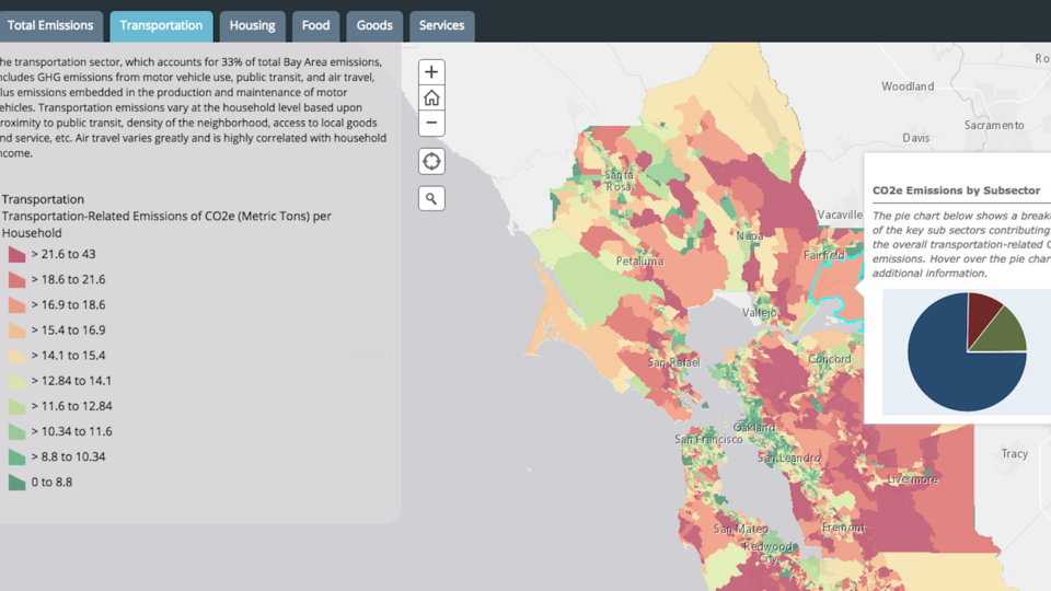
The study, published online last month, found that transportation is the largest source of emissions by Bay Area households (33 percent), followed by food (19 percent), goods (18 percent), services (18 percent), heating fuels (5 percent), home construction (3 percent), electricity (2 percent) and waste (1 percent). In some areas, food accounts for over one-third of emissions.
The authors say cities can use this information to target and change specific behaviors. The team plans to expand the neighborhood data to cover state and nationwide usage, too. “Our goal is to provide high-quality information for the cities and regions that are doing the hard but important work, through encouragement or investments, to reduce their communities’ emissions,” Jones says.
It's useful and engaging for the individual, too. It's easy to spend several minutes or hours looking at who pollutes and how in the area. But don’t feel too complacent if it looks like your carbon footprint is smaller than your neighbor’s! We can all do our part to reduce carbon pollution.